Thursday 18 December 2014

Long And Thins


These are my long and thin samples which I presented onto A2 paper. I used a mixture of techniques and materials to produce these pieces.

Collage:

I started off by gathering materials for my surface, I wanted to incorporate a lot of text into the piece therefore I used newspapers and magazines. I tried to avoid applying PVA onto of the paper as it would have a shiny finish and resist the coffee and ink. The paper added a rough jagged surface texture, which I really like and adds to the authentic look. Next I harshly painted coffee over the entire page and let that dry. Next I drew out the building in pencil and then went over that with ink. To add highlights I used white emulsion and lightly applied it over the lighter edges. After I go to this stage and looked back at it, I thought it looked a bit boring. So I added some purple and yellow touches using fine liners. I am happy with the way this turned out however if I would change anything, I would use less wet medias and add more finer detail.
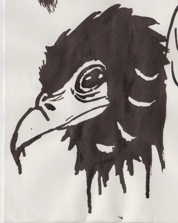
Stick and Ink:

This was the simplest and most easy piece to create as it used the least amount of medias and had the simplest composition. The original image was of an old cherub statue which had been slightly decayed from age. The thing I struggled with the most was getting the broken and rotting parts of the image as it had a complex rough texture to it. I first applied coffee again to the entire canvas. Then I used the stick and ink technique to draw out and add the dark areas of the image. Next I added in the mid tones using stronger coffee. At this point the image was starting to come together and look like something. To add highlights I used emulsion and lightly applied it to the lighter areas. Finally to add detail I used black fine liner and white gel pens, to get add in those intricate highlights and shadows.
This is my favourite of the three samples because I really like the mark making and use of tone.
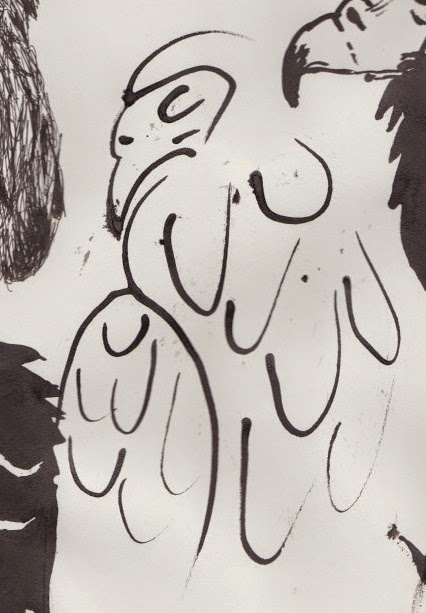
Quink and Bleach

Out of the 3 this was the hardest piece to do as I hadn't used the quink and bleach technique much, and I had chosen a particularly challenging photo. The image was of a wall carving of a ship steering wheel, which had aged and started to build decay. There were a lot of complex textures and debris on the subject,which was hard to capture in my sample. I started off by applying ink to the page and letting it dry over 4 days. I then added bleach to draw out the dark areas creating a negative / inverted effect. Next was to add the highlights using emulsion. I used scrapped it onto the page so it would look rough and have a lot of texture which was present on the original picture, helping to convey the decaying elements on the wall. At this stage it looked like a bunch of patches of white and yellow. I needed to show an indication to what the image was of. To do this I used gold pen to outline it, and added in a few intricate curvy patterns to contrast with the messiness and look more interesting. I was not too pleased with the final outcome, however I do think it works well with the other two when all presented together.

One key feature to all of these studies is texture. I think this helps to show what the subject matter is as it shows the old, rotting, grittiness of the architectural detail. It also allows the viewer to not only look at the work but also feel it, therefore making it interactive and more effective.

Thursday 4 December 2014

Lawson Gallery Visit - Cambridge


I had chosen to visit The Lawson Gallery in Cambridge. I chose this gallery because I have been passion gofer many years when visiting Cambridge, but never actually going in and seeing the work. I would sometimes look through the window and see work which I really like the look of. Once we where told to do this project I initially wanted to go to an exhibition in London. However I could not find an appropriate day to go there and some where hard to find. I then decided to go somewhere more local which lead me to 

The Lawson Gallery. I then looked up the gallery online and found 2 artists who I would like to explore (Ed Robinson, Karen Pittaway). I found that the artwork was very well executed and would contribute well to what I am currently doing in my art. I chose these artist because they all include the aspect of urban, to do with a city environment (Architecture).


Ed Robinson

I found the work of Ed Robinson to be the most relevant to my work as it includes urban environments and mixed media techniques, which is what I'm experimenting in at the moment. 
The painting is of the National Gallery in London on a rainy day. From close observation I found that he used: newspapers, magazines and oil paints. This added a large amount of texture to the piece. The piece had a shiny finish which suggests that he used PVA glue to stick on the paper. The shininess helped convey the fact that in the picture it is raining, as it showed reflections from the light. He also used more newspaper on he buildings closer to the foreground. This helped 

to add to the perspective of the piece and created a literal sense of depth from the texture.
The piece is not incredibly refined however there is actually a lot of detail from the: subject matter, composition and amount of things going on in the painting. I really like this piece as it is very interesting to look at and draws the viewer in.

Karen Pittaway

This piece is an oil painting of Kings Parade in Cambridge. It looks like a busy clear skies day set in modern day. The artist has included a lot of high contrast and detail however it is done in a simplistic style, which is similar to Lour-e. There is no surface texture, therefore the oil paints have been very thinly applied yet still maintains bold colours. My favourite part of the painting is the way she has created perspective and made it look like its a living world and the painting seems a if its alive.

Monday 24 November 2014

Raptor Rapture Foundation - Drawing From Observation

On 6th November we had the Raptor Rapture foundation come in to our classroom, where they brought in 6 of their birds for us to draw. Once everything was set up we where put on our separate tables and placed in our groups. After everyone was seated the birds where brought in and placed on stands on each table. These birds included: Eagle Owl, Bateleur Eagle, White Face Scops Owl, Tawny Owl, Harris Hawk and a Falcon.

On each table there were different materials we could use to draw the birds such as: stick and ink, charcoal, graphite, fine liner, felt tip, pencil, emulsion etc… My favourite materials to use where the stick and ink because I like the smooth elegant lines you ca get, and the way you can make the lines and marks thick and thin. I also liked using the fine liner and onto brown paper which I used to draw the White Face Scops Owl. I like this technique because I used the black fine liner for shadows and drawing out the bird, then I used my white gel pen for highlights. This then made the brown paper act as the mid tone, which worked nicely.

Once we had 30 minutes to draw the bird we then had to move tables, to draw the other birds. I liked drawing all the birds, but my favourite was the Bateleur Eagle because it had the most interesting features and looked magnificent.

I thoroughly enjoyed this once in a lifetime experience and would love to do it again sometime, it was extremely beneficial and helped me produce some good drawings.


Friday 7 November 2014

Raptor Rapture - Photoshop Work

Here are some drawings from the Raptor Rapture drawing session on 6th November, which I have scanned in and edited on Photoshop.


This is a drawing which I have simply just coloured in. It was originally drawn using stick and ink. i really like the digital version as the colours in the birds face stand out and pop.
I took one of my linear line art drawings using stick, and ink and placed it onto an old paper textures so it looks more authentic and aged.
Like the first one I did the same method of colouring in the drawing, however I added a rough gradient to the body, to maintain the rough lines but still be able to indicate where the body if the bird is.


Thursday 6 November 2014

Traditional Samples

Here are a few traditional samples I have made using different mixed media techniques. 

I made this sample by using white chalk onto black sugar
paper. The image I based this drawing off is a mono-
chromatic photograph by Lee Jeffries of a homeless man.
There are a lot of dark areas in this image which help to
show the dark and dull overall theme of the piece. To add a
touch of detail I used graphite for the pupil of the eye, so
it would create reflections like a real eye and add a sense of
life and realism. 

I used a variety of materials and techniques to create this
piece. The materials used where: Pastels, fine liner, ink,
watercolours and pastel. I especially like the way I
did the water showing the reflections and shimmers on the
surface of the water.

I based the style of this piece off Russell Mills Painting
work, by using a very high contrast and including both
messiness and fine detail. To achieve this affect I used:
ink, fineliner, bleach, coffee and dyes. I am happy with the
way this sample turned out however it came out a bit too
messy. Therefore if I were to do it again I would be more
careful when using the wet medias.


Digital Samples


Here are a few digital samples I have produced using multiple techniques and processes, based of certain artists styles.


This piece is based off a digital illustrator
called Rua. I chose to do the Joker as his
subject is often comic book characters.
And the Joker is the closest to an Urban
like character.

Here is a photo manipulation I did of a rhino (referring to
rural) using parts of a motorbike (referring to urban).
This is my favourite digital piece as it looks the most
interesting and creates the biggest impact.

This is an image of a cityscape, done in a paper cut style
where I made the buildings closer to the foreground lighter.
I also made various buildings red to give the piece more
colour.

This is a vector graphic I made inspired by various basic
colourful graphics I found when researching. I first made
the left image. However once I finished it, I thought it
looked a bit borings I reflected the image and changed it
to night and day. 

I was researching an artist called Aryz who is a graffiti artist
and decided to do skulls in his style as skulls are one of his
main subject matters.

This is based on an artist called Josh Bryant, where he uses
lines to create an origami like look to the piece. I wanted to
make the piece my own by adding colour to the shapes.

Friday 4 July 2014

Norwich Trip


What We Did

We met at the train station in Cambridge and caught the train to Norwich. Once there, we had to walk over to the University. Whilst walking on campus I noticed some of the old buildings with lots of architectural detail, they reminded me of the Cambridge buildings I was familiar with. This helped me to visualise myself at Norwich University. The first part of the Degree Show we viewed was the: Games art, illustration and graphic design. I really liked all three of these exhibitions, however my favourite was the games art as the work was the most detailed and diverse. There was a mixture of: concept art, digital animation, playable 3D games, character designs, sketches, texture designs and scene and landscape designs. This course appealed to me the most as it opens a lot of doors for me and steers me into the right sort of career I would like to pursue, which is in the game and media art industry. On the other hand I also really liked the Illustration work, because there was so much variety between the pieces as there was a mix of digital and traditional work. There were pieces for: book illustrations, magazines, games and films.
After lunch we went into another building opposite and looked at: Fine art, film making, textiles and sculpture. Most of the work I saw was very expressive and very strange. These pieces varied from sound art, 3 TV's facing each other playing disturbing images and sounds and a broken stairway leading to a key on string. However I saw a few pieces which where very interesting, and some work which showed a lot of technical skill, which I really liked. The final part of the show was the fashion and animation. I really liked the animations as all the movies were all different and all technically good. My favourite was a 3D animation by a student. The animation showed the life of a man who was cursed and was trying to be good but always hurt everything he touched. I liked this short best because it had the best technical 3D animation and created the biggest impact when watching it. However some of the animations were very strange, and I didn't get what the message of the film was.

_________________________________________________________________________________

Wednesday 2 July 2014

NDAD Year 1 Exhibition Invitation Design

Recently I was asked by my previous teacher to design the invitation for the NDAD Year 1 Art Exhibition, which my work is being displayed in, alongside my classmates work. I had produced three outcomes and then left it up to her to choose which she preferred. In the end she chose the one below, which I entirely agreed with as it looked the sleekest and most professional. I am happy with this design and wouldn't change anything if I did it again.

When selecting the artwork which I would then incorporate into my design was quite challenging, as there was a vast amount of diversity amongst the pieces. I wanted to showcase all the different types of art styles and techniques in my invitation, therefore people who saw the invitation would want to go.
To arrange the images I chose to display them in an interesting artist way, so it would look sleek as well as well as arty. To do this I overlapped them all as if they were in a collage.
When creating the different variations and designs I wanted to keep the image arrangement because it took a long time to get right, and I was happy with the final result.
The design overall feels very professional and slightly arty as most galleries are very plain and white, this would therefore showcase the work better. I incorporated this idea into my invitation, which is why I used mainly black and white.


Tuesday 1 July 2014

Drawing In Cambridge

This was done using pencil and I was stood on another bridge
over the river, so I could get a high up viewpoint and see
everything in clear view.
I produced this piece by drawing using felt tip and not taking
my pen off the page. I found this technique quite difficult
and it gave an interesting effect. I don't really like this
drawing as it looks a bit too surreal for me.
I found drawing in Cambridge very inspirational and informative towards my Urban and Rural unit. I produced several drawings of the surrounding area, mostly to do with rural. 
We visited the Punting River and Parkers Peace therefore, there was a lot more rural sites then urban. I am happy with my drawings as I used a wide  range of techniques and medias, such as: Fine liner, pencil, charcoal and felt tip.


I wasn't quite sure how this drawing was going to turn out as I
drew it without looking down at the page. I didn't see it until I
had finished scanning the building. I quite like the effect of
this drawing as it looks quite interesting and as if the building
is moving.
To draw this image I used a felt tip and was very expressive
and almost cartoon like when drawing it. For example when
I drew the water, I wanted to add every ripple and stream I
saw using lines. This technique did not go as I planned, but
I still like the effect it creates.


For the final image I drew the punting river from a bridge
overlooking the punts bay. I used a fine liner to draw it. Most
of the details in the image went to plan, however I wasn't sure
how to approach the water so I decided to shade in black the
areas which were not affected by the light. I also didn't get to
finish it as it was supposed to be a 3 minute drawing.

Anglia Ruskin University Degree Show

Anglia Ruskin University Degree Show


On Friday 20th June my art group and I attended the Anglia Ruskin Art and Design Degree Show. The show consisted of 8 separate exhibitions for the different art medias which were: Illustration, Graphic Design, Game Design, Fashion, Fine Art, Interior Design, Animation and Photography.

Out of the areas my favourite was Illustration and Game Design. 
I liked Illustration as the work was very professional and mixed both practical techniques with digital. My favourite piece of the collection, were the comic books, produced by Nicky Durham.
I also really liked the Game Design work, as the students had made actual working games which looked like something I would be interested in playing. My favourite work from this are was the concept artwork produced by Jonathon Shilling. His digital paintings were very detailed, and looked like the artwork you would see from a professional games company.

Overall it was a very good trip which I thoroughly enjoyed, I took a lot of inspiration from the work displayed and will definitely go back next year. From seeing the work and outcomes produced by the students at Anglia Ruskin, I am now a lot more interested in attending Anglia Ruskin University myself.

Nicky Durham: 
www.nickydurham.co.uk
nicky.durham@hotmail.com

Jonathon Shilling:
http://jonshills.daportfolio.com
jonathonshilling@hotmail.com

_________________________________________________________________________________

Thursday 12 June 2014

All My Year One Work Is Complete!


All My Year One Work Is Complete!


Finally finished all of my year one work and handed it in. Hope I have done well, and achieve the grades I want!

_________________________________________________________________________________