
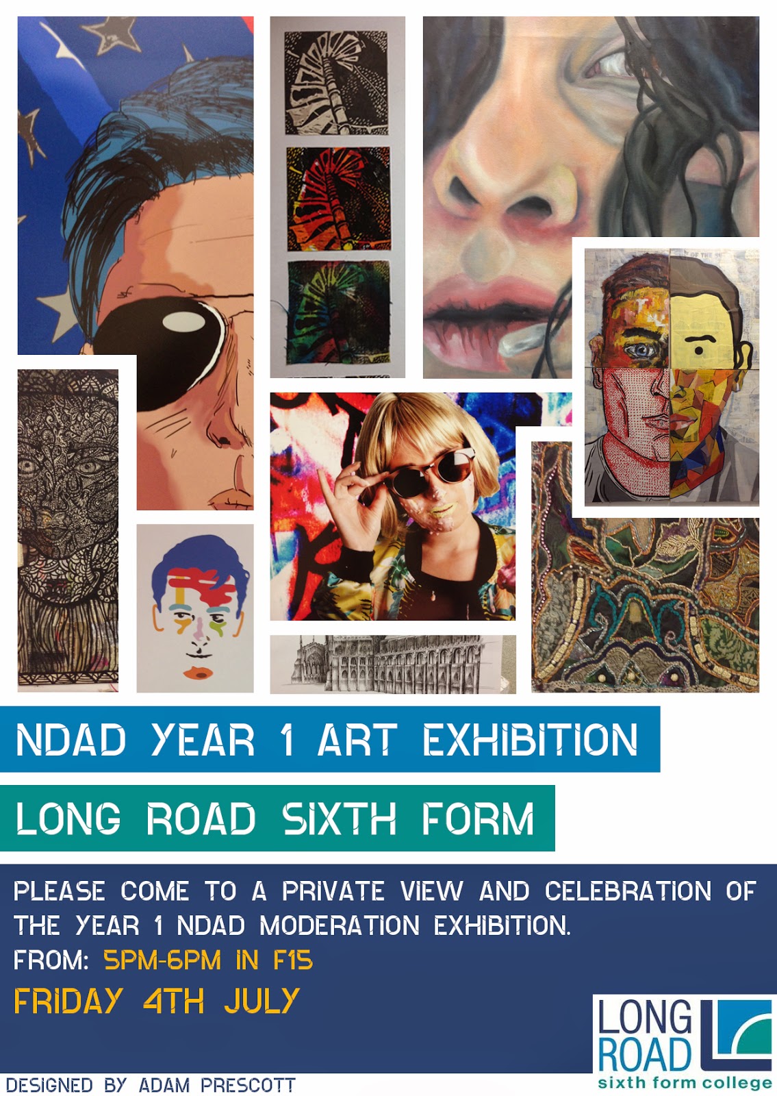

When selecting the artwork which I would then incorporate into my design was quite challenging, as there was a vast amount of diversity amongst the pieces. I wanted to showcase all the different types of art styles and techniques in my invitation, therefore people who saw the invitation would want to go.
To arrange the images I chose to display them in an interesting artist way, so it would look sleek as well as well as arty. To do this I overlapped them all as if they were in a collage.
When creating the different variations and designs I wanted to keep the image arrangement because it took a long time to get right, and I was happy with the final result.
The design overall feels very professional and slightly arty as most galleries are very plain and white, this would therefore showcase the work better. I incorporated this idea into my invitation, which is why I used mainly black and white.
No comments:
Post a Comment