Monday 24 November 2014

Raptor Rapture Foundation - Drawing From Observation

On 6th November we had the Raptor Rapture foundation come in to our classroom, where they brought in 6 of their birds for us to draw. Once everything was set up we where put on our separate tables and placed in our groups. After everyone was seated the birds where brought in and placed on stands on each table. These birds included: Eagle Owl, Bateleur Eagle, White Face Scops Owl, Tawny Owl, Harris Hawk and a Falcon.

On each table there were different materials we could use to draw the birds such as: stick and ink, charcoal, graphite, fine liner, felt tip, pencil, emulsion etc… My favourite materials to use where the stick and ink because I like the smooth elegant lines you ca get, and the way you can make the lines and marks thick and thin. I also liked using the fine liner and onto brown paper which I used to draw the White Face Scops Owl. I like this technique because I used the black fine liner for shadows and drawing out the bird, then I used my white gel pen for highlights. This then made the brown paper act as the mid tone, which worked nicely.

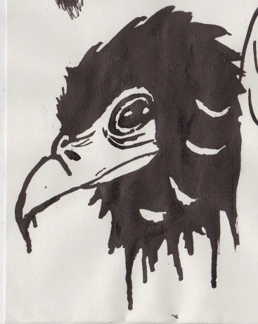
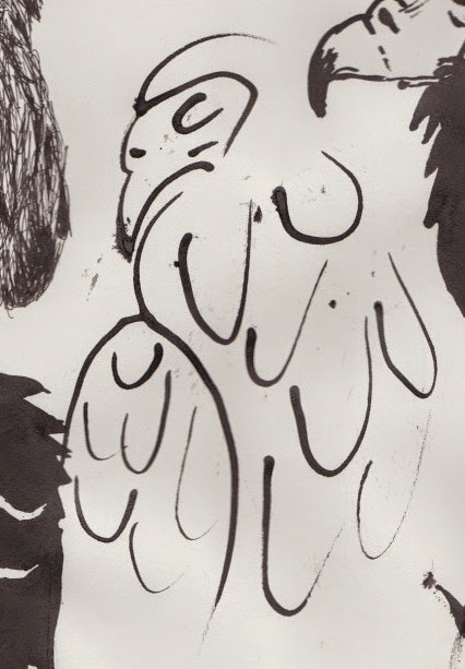
Once we had 30 minutes to draw the bird we then had to move tables, to draw the other birds. I liked drawing all the birds, but my favourite was the Bateleur Eagle because it had the most interesting features and looked magnificent.

I thoroughly enjoyed this once in a lifetime experience and would love to do it again sometime, it was extremely beneficial and helped me produce some good drawings.


Friday 7 November 2014

Raptor Rapture - Photoshop Work

Here are some drawings from the Raptor Rapture drawing session on 6th November, which I have scanned in and edited on Photoshop.


This is a drawing which I have simply just coloured in. It was originally drawn using stick and ink. i really like the digital version as the colours in the birds face stand out and pop.
I took one of my linear line art drawings using stick, and ink and placed it onto an old paper textures so it looks more authentic and aged.
Like the first one I did the same method of colouring in the drawing, however I added a rough gradient to the body, to maintain the rough lines but still be able to indicate where the body if the bird is.


Thursday 6 November 2014

Traditional Samples

Here are a few traditional samples I have made using different mixed media techniques. 

I made this sample by using white chalk onto black sugar
paper. The image I based this drawing off is a mono-
chromatic photograph by Lee Jeffries of a homeless man.
There are a lot of dark areas in this image which help to
show the dark and dull overall theme of the piece. To add a
touch of detail I used graphite for the pupil of the eye, so
it would create reflections like a real eye and add a sense of
life and realism. 

I used a variety of materials and techniques to create this
piece. The materials used where: Pastels, fine liner, ink,
watercolours and pastel. I especially like the way I
did the water showing the reflections and shimmers on the
surface of the water.

I based the style of this piece off Russell Mills Painting
work, by using a very high contrast and including both
messiness and fine detail. To achieve this affect I used:
ink, fineliner, bleach, coffee and dyes. I am happy with the
way this sample turned out however it came out a bit too
messy. Therefore if I were to do it again I would be more
careful when using the wet medias.


Digital Samples


Here are a few digital samples I have produced using multiple techniques and processes, based of certain artists styles.


This piece is based off a digital illustrator
called Rua. I chose to do the Joker as his
subject is often comic book characters.
And the Joker is the closest to an Urban
like character.

Here is a photo manipulation I did of a rhino (referring to
rural) using parts of a motorbike (referring to urban).
This is my favourite digital piece as it looks the most
interesting and creates the biggest impact.

This is an image of a cityscape, done in a paper cut style
where I made the buildings closer to the foreground lighter.
I also made various buildings red to give the piece more
colour.

This is a vector graphic I made inspired by various basic
colourful graphics I found when researching. I first made
the left image. However once I finished it, I thought it
looked a bit borings I reflected the image and changed it
to night and day. 

I was researching an artist called Aryz who is a graffiti artist
and decided to do skulls in his style as skulls are one of his
main subject matters.

This is based on an artist called Josh Bryant, where he uses
lines to create an origami like look to the piece. I wanted to
make the piece my own by adding colour to the shapes.